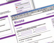
The Securicor Information Systems site had never been at the forefront of the company’s promotions. As a bolt-on to the corporate Securicor site, it was hidden and rarely updated. Following the launch of the company as Vivista, a simple holding site was produced by Anderson Baillie to introduce Vivista and communicate their key solutions. This site generated a high level of response with a number of key business leads generated. Following this success it was decided that the new full website would become central to the company’s external communications.
Anderson Baillie were tasked with managing the design and production for the new website. The design would be based around a Content Management System to allow Vivista flexibility to update the site themselves.
Vivista wanted to ensure that the website demonstrated their breadth of capability. Although their core skills lie in the provision of ICT to the public sector, and in particular the Emergency Services, their future strategy is to apply these skills to other markets. Also important to them is their growing capability in the area of Business Support Services which they hope to expand upon.
A key objective for Vivista was to create a straightforward user experience where visitors have the option of viewing content specific to either market segments or solution areas.
It was also important to maintain a balance between creating a site that was content rich without being too in-depth so that visitors are encouraged to contact Vivista to find out more.
The site needed to provide simple navigation that allowed easy access to key content and created an environment where users could easily identify what they were looking for.
Following the creation of Vivista’s new brand, Anderson Baillie began to consider its application onto a website.
Firstly a number of design concepts were produced to give Vivista an idea of how the site might look. It was suggested that important content such as news and customer case studies were retained on the screen throughout all pages. This would give improved navigation for users and minimise the number of levels of content required.
The clean lines associated with Vivista are retained on the website and the use of flash brings the images to life on the home page.
Following approval of the design concepts, the architecture of the site was developed. A site map was produced to show the linkages of the pages and a full page-by-page breakdown of the content required. Anderson Baillie worked closely with a number of representatives from Vivista to ensure that all areas of the business were being accurately represented.
As the development team then began to build the structure of the site, the project team co-ordinated the development of the content – devising a schedule of activities to ensure content was completed in sections that would allow the site to be built in a controlled manner.
On commenting on the site, Martin Hewitt – Head of Systems Function at Vivista said:
“Just a quick note to say that, on having looked through the new Vivista web site this morning, whoever has set it up must be congratulated on it. It really is a great site, easy to use, full of relevant information and an excellent representation of our business…truly inspirational!”


